
About this project
A real, human personal stylist who knows what you like and improves over time
Bombfell is a menswear subscription styling service based in New York City. Our customers sign up online, put in their measurements and style preferences, and are matched with an in-house stylist who picks and sends clothes for them at set intervals. Our customers only pay for what they want to keep and are free to return the rest. Because of this model, we prioritize lifetime value and strive to build strong relationships with our clients, which requires a platform that encourages as much feedback and communication as possible. Given the diversity of projects I work on, an overview of each project is described below:
PROJECTS
- Tailoring the landing page for acquisition
- Optimizing budgets on the onboarding flow
- Reorganizing customer dashboard account navigation
- Prototyping new iOS app features for gathering user style preferences
- Building multi-touch customer journeys

PROJECT 1
Tailoring the landing page for Acquisition
Since our homepage is the first Bombfell property that our paid marketing and organic traffic goes to, I spend a lot of my day measuring KPIs and designing tests and redesigns to optimize for conversions. Early wireframes are often done with sketches, especially in laying out how the site will adapt to mobile devices, where most of our inbound traffic comes from.
We often test the order of sections displayed on the page, forming a hypothesis for what best persuades a customer to sign-up and then measuring conversions in an analytics tool like MixPanel.
We were surprised the learn that the longest page ended up out-performing alternates. Because our business model is relatively new in the retail space, our visitors may have responded to the extra details of how the business model worked.
Iterations of the landing page mocksI'll monitor figures such as:
- Unique visitors over time
- Bounce rate
- Click through rate on Call-to-Action buttons (and which ones)
- % of users who start the account creation process ("begin on-boarding")
- User journey on the site of pages they visit (How It Works, FAQ, Threads, etc.)
- Volume of customer service tickets being created from the "Contact Us" form
- Running multiple versions of a creative or marketing copy to emphasize various demographics, seasons, inventory, service value/selling point, and more
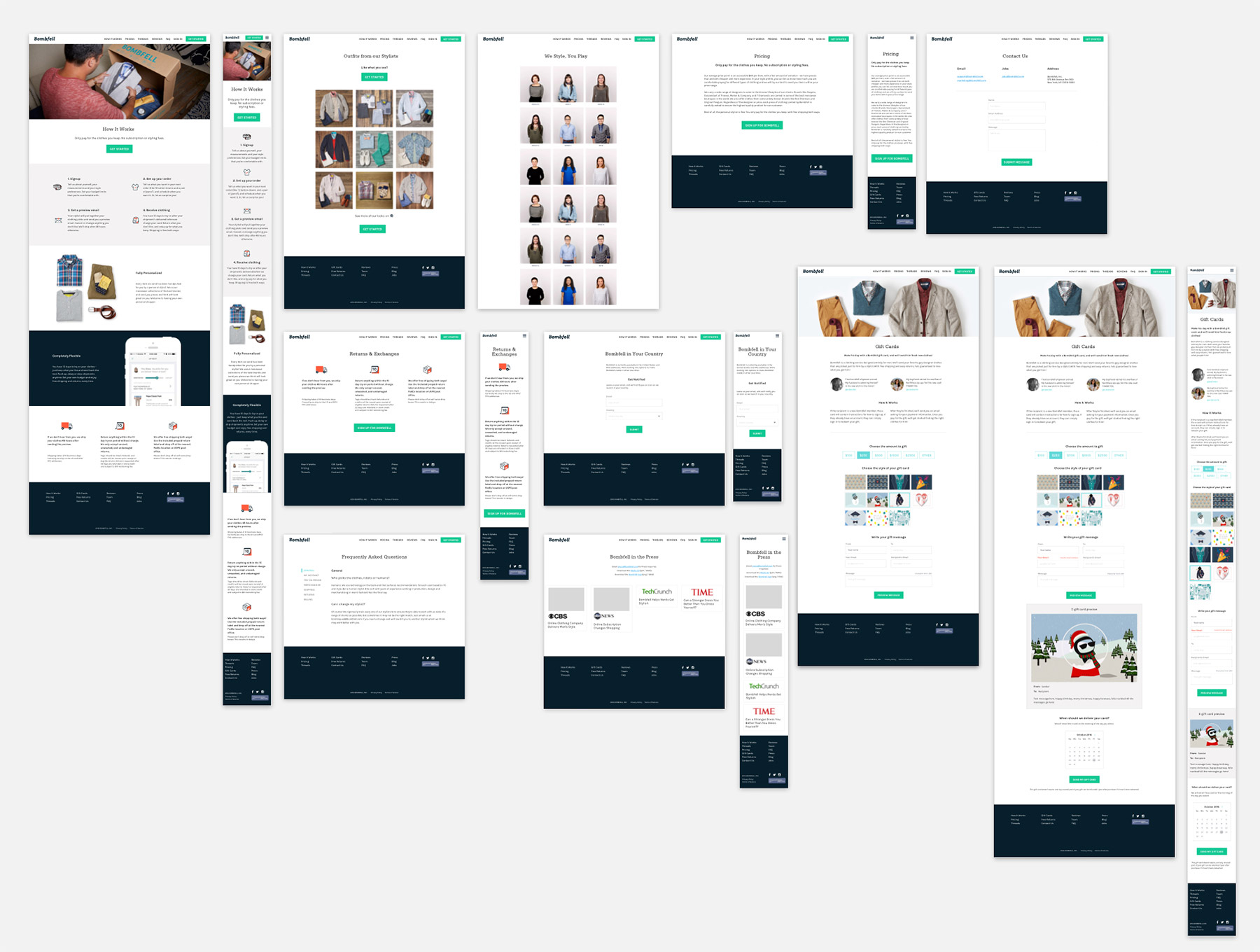
Maintaining an accurate, on-brand website that sells our services
The content on our website is constantly being tested, reevaluated, and tweaked in a constant stream of iterations. Working in conjunction with the Marketing team at Bombfell, we do our best to explore these questions:
- Who are our users and what service qualities or creative assets appeal to them most?
- What content is most informative and effective at getting visitors to start the onboarding flow?
- What is the clearest, most accessible way to answer FAQs and reduce our Customer Service ticket burden?
PROJECT 2
Optimizing budgets on the onboarding flow
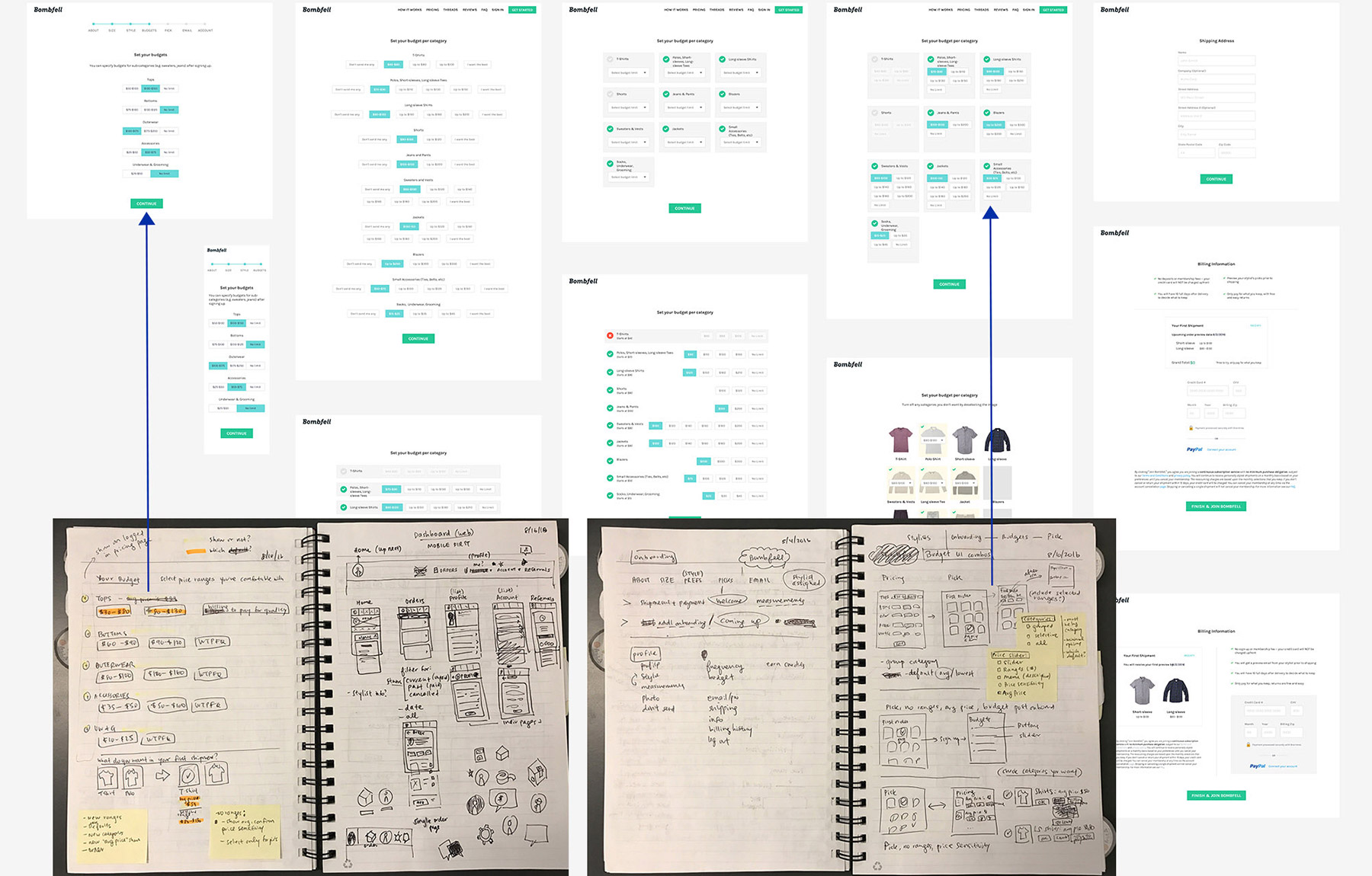
To find a user’s willingness to pay in onboarding, we ask for his preferred budget range per category. This enables stylists to pick something a customer is more likely to accept, while also signaling Bombfell’s cost to potential users. A simpler UI allows more users to complete the sign- up process, but risks letting price- sensitive users in that will later churn out. I iterated on the design of the budget form many times to find the perfect balance between accuracy and expediency.
The form had to be short and mobile optimized, which our current extended drop-down form lacked. I tried different category groupings, button inputs, and option amounts to minimize the number of clicks required to go to the next step.
The winning version showed budgets split out as split button groups rather than drop-downs for easier selection on mobile. We also grouped specific item types (e.g. T-shirts, Long-sleeves) into broader categories (e.g. Tops) to streamline the process. While this optimized for number of completed accounts, this required us to follow-up extensively to tweak the detailed subcategory budgets later.
We tried other versions showing examples of the category (e.g. thumbnail of a polo with a drop-down menu) and breaking out price ranges into more descriptive increments, but the lack of uniformity across a diverse inventory made the form long and cumbersome.
Customer onboarding flow
PROJECT 3
Reorganizing account navigation on the customer dashboard
Bombfell’s existing customer dashboard focused on displaying operational information, but hadn’t been built with the customer’s needs in mind. As a result, most of our customers interacted with us through email. To increase use of our dashboard, I planned a redesign focusing on:
- Opening an engaging, fun experience for customer/stylist dialog to build their relationship
- Show anticipated customer questions about order information to reduce customer service ticket load and improve customer sentiment (NPS score)
- Improving ease of capturing feedback, thus gathering more accurate data on t and style preferences
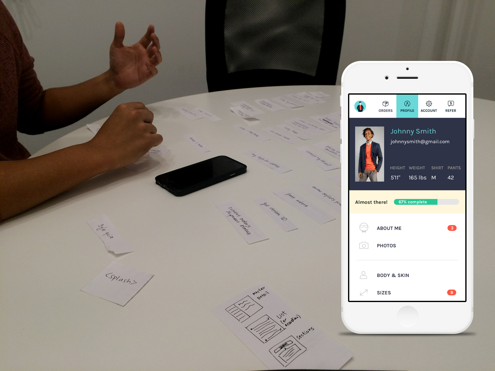
As a side effect of a mobile-optimized account dashboard experience, customers were more willing to explore their account. By including a placeholder user icon, we quadrupled the amount of profile photos after launch, helping our stylists better visualize how to style a customer.
However, the most important section - measurements - still had low completion rates, even after comprehensively improving the UX of selecting measurements. I learned that the product itself had to be streamlined. While our data scientists and stylists would always appreciate more data, users can feel overwhelmed beyond a tipping point and refuse to give any data at all.
The redesigned customer dashboard helped improve the customer experience by:
- Improving ease of capturing feedback on an order, thus gathering more accurate data on fit and style preferences
- Opening a dialog between the customer and the stylist to improve ease of styling and build their relationship
- Providing order/shipment information clearly and conveniently for customers
- Anticipate customer needs and provide commonly asked for information and tasks clearly in the dashboard, to reduce customer service ticket load and improve customer sentiment (NPS score)
- Creating an engaging, fun experience for customers to share more about their style and preferences (to help our stylists and improve our customers' experience)

PROJECT 4
Prototyping new features on the iOS app for gathering user style preferences
I worked with data scientists to spec a “Discover” feature on the iOS app that allowed users to “swipe right” on styles that they liked, giving users a better grasp of our product offerings and providing valuable style data for our stylists. With little to no promotion, this discovery tool became one of our most engaging interfaces. With an average of 600 swipes per app user, our data scientists built a successful prediction algorithm with over 6 million data inputs. In customer feedback, many of our superusers shared how they used the Liked list to curate and develop a style board for their stylists. This customer insight was extremely helpful in prioritizing actual in-app features on the stylist panel and customer dashboard that sought to support this type of style curating as well.
With little to no promotion, this discovery tool became one of our most successful data inputs that helped us understand and evaluate our inventory, with average engagement of over 600 swipes per user.
In customer feedback, many of our superusers shared how they used the Liked list to curate and develop a style board for their stylists. This customer insight was extremely helpful in prioritizing actual in-app features on the stylist panel and customer dashboard that sought to support this type of style curating as well.
iOS app "Discovery" feature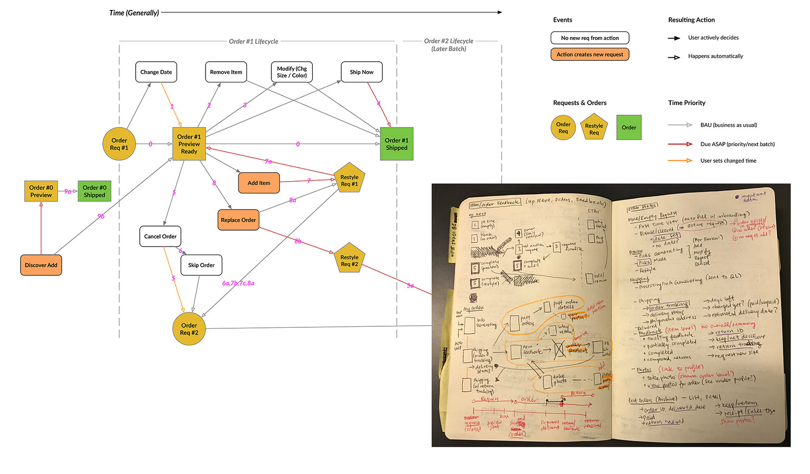
Project 5
Building multi-touch customer journeys
Given the complexity of our customer experience, we’ve come to recognize the importance of designing mobile-first and focusing on holistic cross-channel experiences.
I diagrammed the user journey between digital products to prioritize improvements in the order ow. In the process of creating a new order, we noticed users many times before the order shipped to minimize unwanted shipments, but were missing opportunities to remind users to complete feedback after the order was received. Mapping out the order ow helped my team roll out more reminders during the try-on period to encourage feedback (and payment) more quickly. However, as we continue to test, we have to be cognizant not to overload the user with notifications and risk being ignored.
Communicating with our customers when their next order was coming up and sending regulated reminders when their current order's try-on period was expiring contributed to increasing our inventory turn, decreasing our customer complaints, and increased profit (by reducing cost of returns and unwanted shipments). In working sessions with our Operations, Customer Experience, and Dev teams, I sketched out early iterations of the order how was designed.