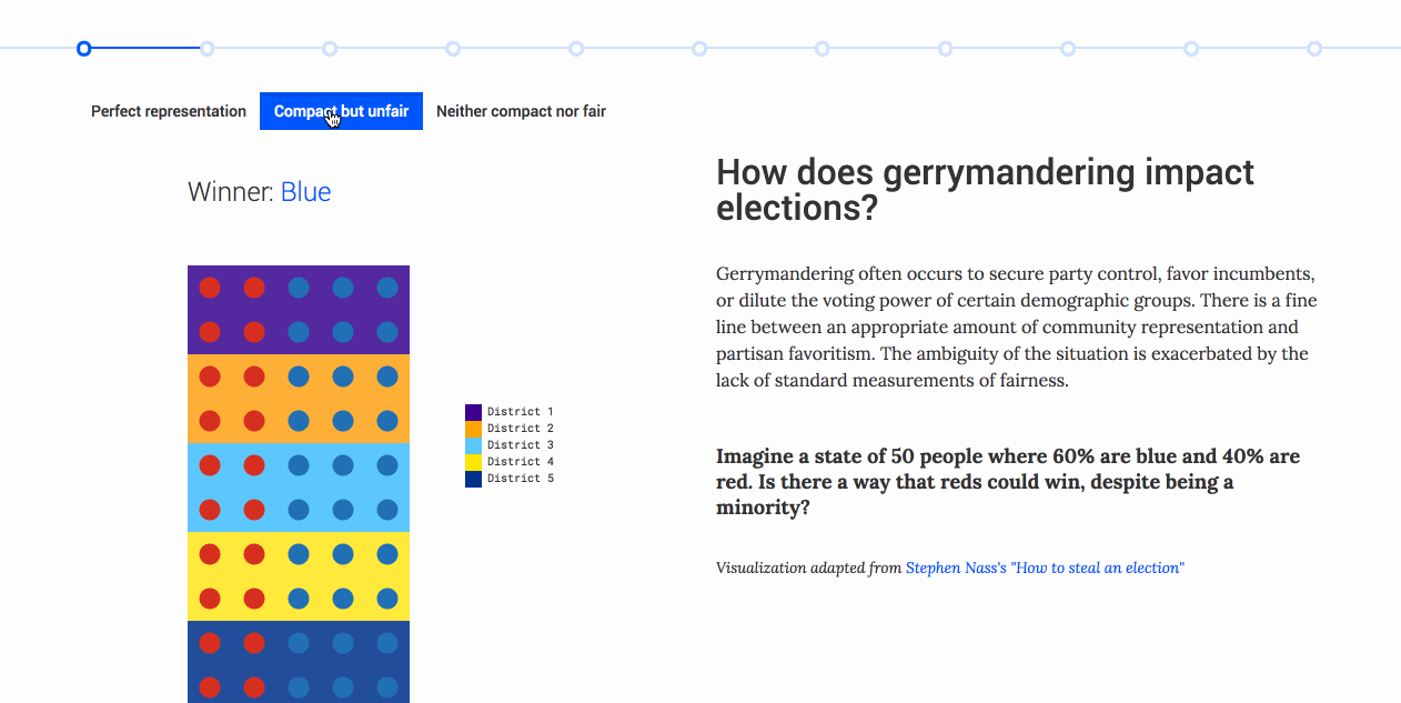
Impact on districts
Gerrymandering can force fixed, static populations to "belong" in different districts, affecting election outcomes. This visualization uses a matrix array that toggles between district configurations to show how a static population can be regrouped to allow a proportional minority party to win.
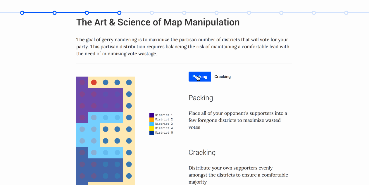
How it works
Using the same matrix data, we demonstrate how the most commonly used strategies for gerrymandering ("packing" and "cracking") can bias a certain side.
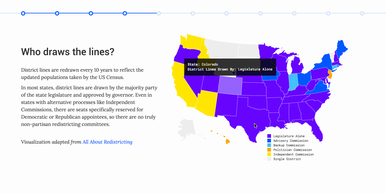
Rule-makers and breakers
The rules of who draws district lines vary from state to state. We use a chloropleth and tooltip to show which states rely on legislatures and organizations with potential conflicts of interest in district drawing.
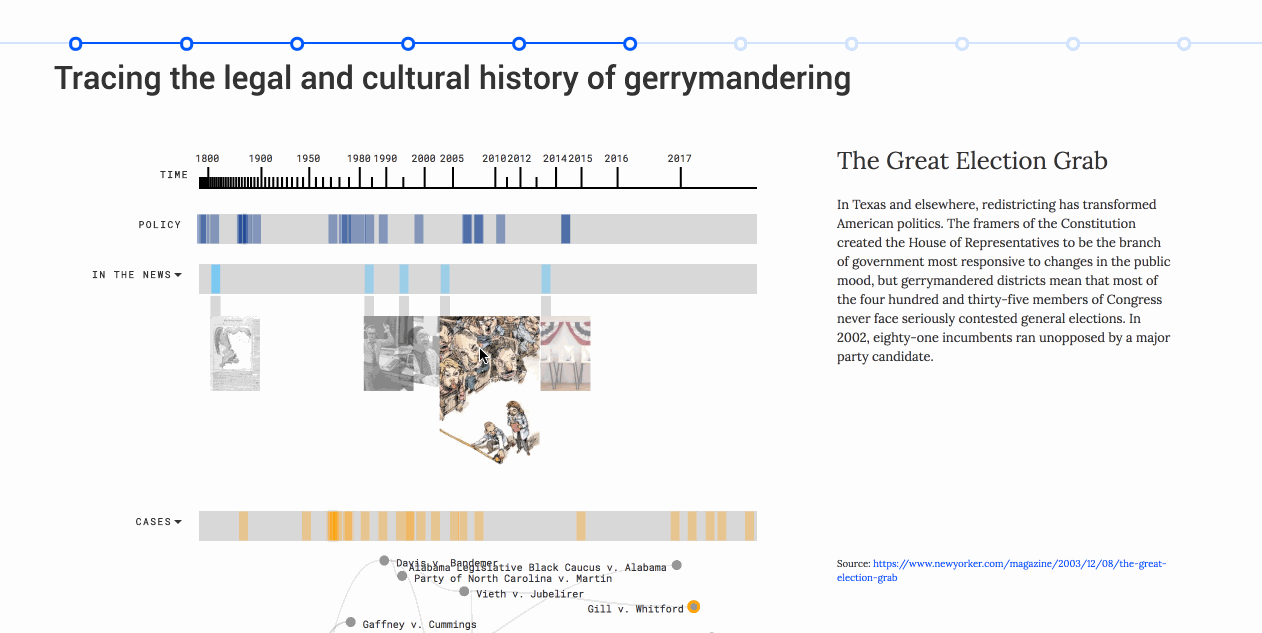
Custom timeline/legal precedent visualization
We created an interactive timeline tracing the origins of gerrymandering across various primary sources of political, legislative, and news events. Most importantly for the Gill V. Whitford case, we show the various related legal cases and precedents it is based on, with an eye towards the future – depending on the Supreme Court's decision, an acceptable use of the Efficiency Gap as a test for district fairness could spawn a number of cases branching out of Gill v. Whitford in the future.
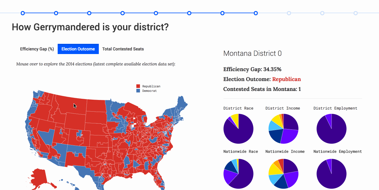
District-level chloropleth
Finally, our visualization culminates in a broad, district-wide tool using 2014 election data to visualize the Efficiency Gap that quantifies the "fairness" of a district's lines. We also overlaid the constituency's demographics, election outcome, and relative impact of the district through number of statewide contested seats. By toggling into the selected data view, we allow the reader to easily find the districts with the highest efficiency gaps, which often also have the most severe demographic skews from their surrounding neighbors.