Visualizing health and loneliness among aging Americans
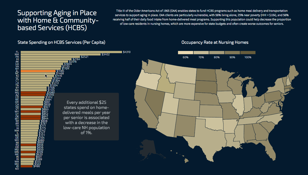
For my studio assignment on visualizing health data, I explored data visualizing the impact of loneliness among aging Americans. I overlaid two data sets to answer the question of how funding for home-based care impacted the overall healthcare spending on nursing homes. I wanted to investigate whether increasing support for Aging in Place, home and community based services (HCBS) could reduce overall aging expenditures, and how different states handled the process.
D3 slider and data selector
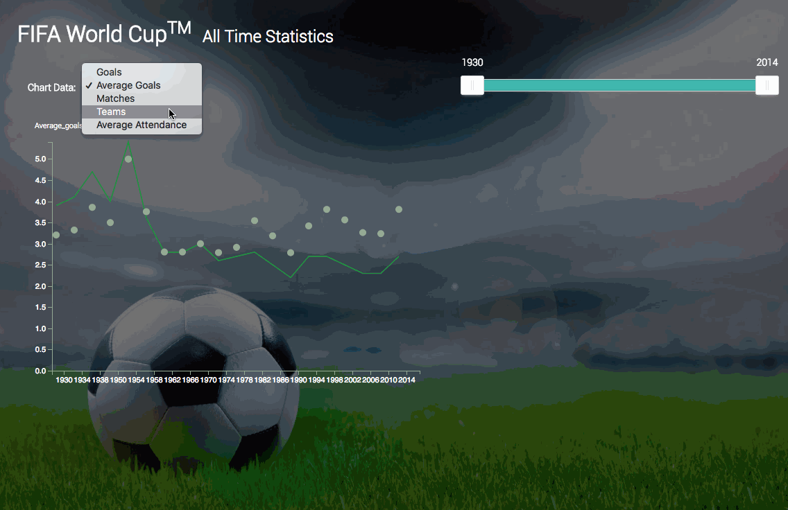
For a class assignment using World Cup statistics, I created a visualization that scrubs through multiple years of data to display the selected metric of interest.
D3 sorting and keying
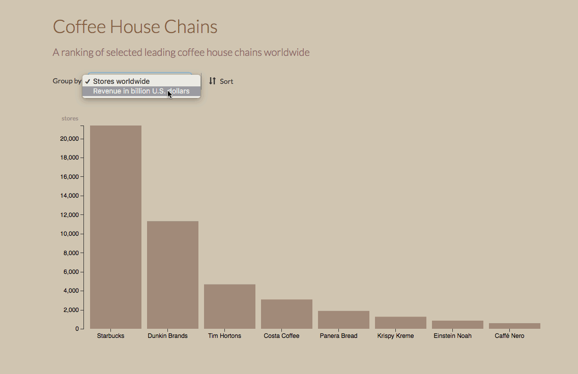
This visualization makes use of D3's built in sorting methods using data about top coffee house chains.
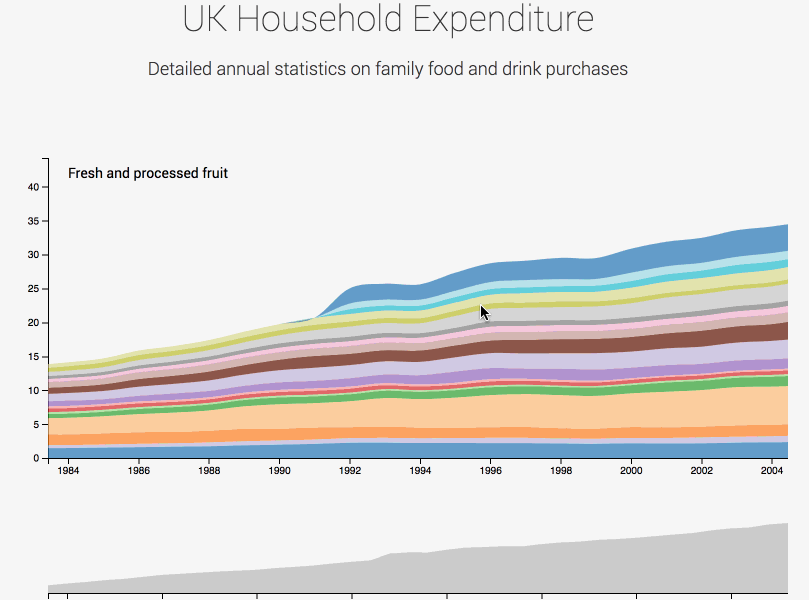
D3 Brush & Zoom
This visualization uses UK household food expenditure data to show a stacked area chart that can be filtered by time with a brush & zoom method.
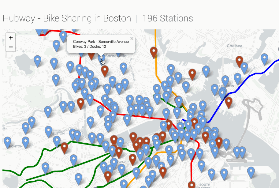
Leaflet.js and Hubway API
This map uses Leaflet.js to generate a map and overlay data about the availability of Boston's Hubway bikes using their API. (Exciting to learn a little about using maps!)
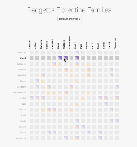
Split-Matrix diagram
This visualization uses a custom SVG shape to generate a split-matrix diagram based on bi-dimensional data provided to my class about a famous Florentine family's involvements in politics.
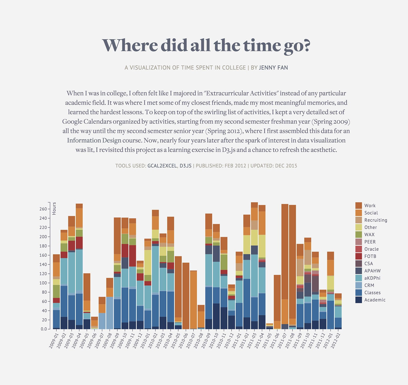
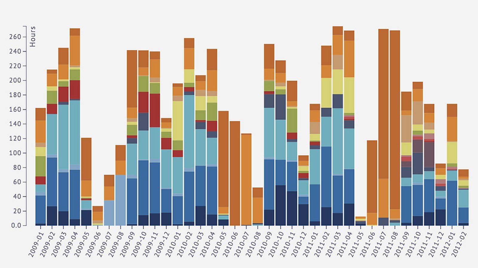
Where Did All the Time Go?is a basic interactive visualization UPenn's Information Design class, mapping the time I spent across all of my activities in college, broken down by organizations. The data is extracted from a Google Calendar using the GCal2Excel tool. I was inspired by the personal data collection of Nick Felton.
I particularly appreciated this assignment, as it transformed how I thought about mapping and how it relates to data visualization. Prior to this assignment, I thought about maps only in relation to geography. This project allowed me to explore the more abstract meaning of a map as any sort of diagrammatic representation/relation of one thing to another. After some brainstorming, I chose to map the relationship in how I spent my time across activities, rather than focusing on any physical or geographic relationships.
When I started, I hoped to redo this project using D3 and JSON to make this more dynamic and update the aesthetic. 3 years after I initially did this project, I finally got around to it, which is up now in it's final form.